
The omnipresent AI conversation
I am writing this in early 2026. If you're reading this, you certainly know that Lovable, Claude Code, Figma Make, and so on, are showing up explicitly everywhere: in job postings, in design community conversations, in email newsletters. At work, I'd been using Claude frequently as a thought partner, and also recently started using Lovable for some vision design work. Claude still has a hold on me, but I was finding Lovable fast but limited. Since I began my career as a developer, using Claude Code with Cursor appealed to me and I wanted to try it without waiting for tool approval or an appropriate project at work to present itself.
Horizon was the vehicle. It's a financial planning tool for retiring abroad, which is a problem space I know personally and care about. It also feels relevant to the national conversation, as more Americans than ever look to leave the country. From day one, I set a high visual bar: Art Deco feel, dark navy, serif headers, and a fluted texture I made myself. Although I was using AI, I wanted to ensure that nothing looks like generic AI output. AI is my productivity tool, not a replacement for my design expertise.
Before jumping into code, I grounded the project in design thinking: a service blueprint, a persona, a couple polished visual mock ups, and wireframes for the other screens. The upfront work paid off, but there were still many messy moments to learn from.
Grounding the product in a real user journey
Persona: Claire Hartley
Claire is 38, a Senior UX Strategist in Seattle. Practical, financially savvy, well-traveled. She's not moving to Lisbon on a whim. She wants a real number, a real timeline, and a real plan. She came to Horizon after a friend mentioned looking into early retirement, and she started wondering: could I do that?
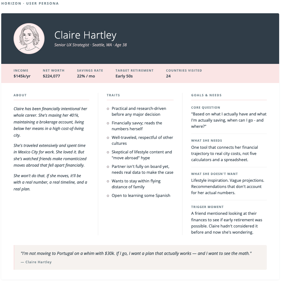
Claire Hartley: The target user for Horizon
Service blueprint
Before designing any screens, I mapped Claire's full journey across five phases: trigger, onboarding, understanding, exploration, and planning. The blueprint defined what she does, what she sees, what the system does behind the scenes, what APIs and AI calls are involved, and how her emotional state shifts across the journey.
The most important moment in the blueprint is Phase 4: Exploration. Rather than a traditional filter or search interface, Horizon uses natural language to interpret user intent and continuously refine city recommendations. While the app collects some basic savings info and preferences as a baseline in onboarding, she's not selecting checkboxes or filters to curate her recommendations. She's having a conversation. This is a meaningful shift in how users express preference in a product, and I think it points toward where AI-native interfaces are heading.
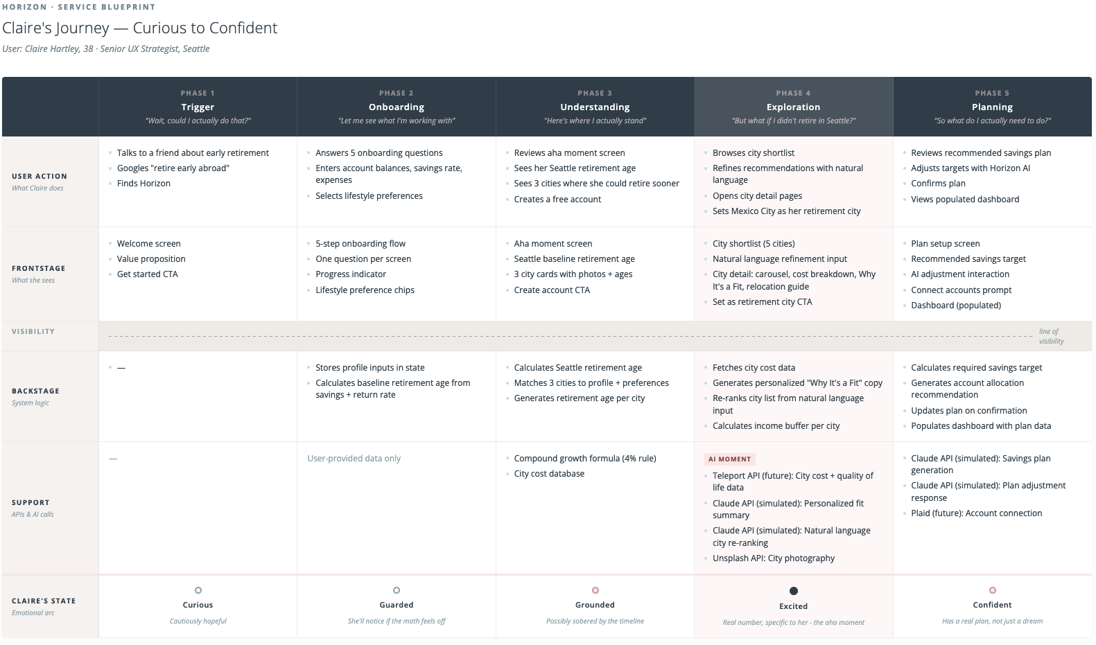
Service blueprint mapping Claire's journey from curious to confident
Wireframes
My process lately has been to externalize in detail my design plan to Claude. I go through the desired functionality, the problem to be solved, and the user flows and logic. Claude helps me pressure test these ideas and organize them. It's almost like I'm writing a detailed design brief for myself, brain dumping all my ideas into an ultimately articulate document. It's then easy to go into wireframes directly inside Claude since it already has all the context and I can direct the output as opposed to creating it by hand. The wireframes defined navigation structure, basic content hierarchy, and what data lived on each screen.
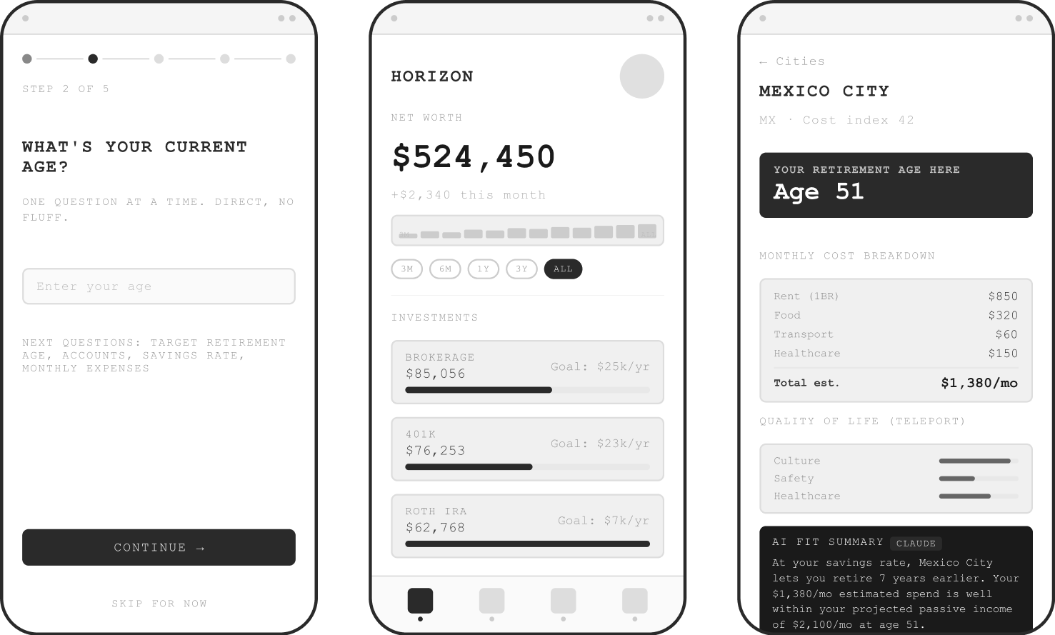
Wireframes directed by me and made with Claude
Visual Design Direction
I then chose two screens for high fidelity design which would define the visual language of the entire app. Based on my research on AI-native tools, this was the way to go, and I was very curious to see if that was true. I also understood that Midjourney was the cutting edge way to get visual design inspiration. Instead of searching Dribbble, the most sophisticated workflows were leveraging Midjourney to create inspirational artifacts specific to their project. After some wrangling, I was able to get an output from Midjourney that did indeed feel like the direction I wanted. From that, I defined a color palette and typography. I later evolved the palette to warmer sunset colors that are more aligned with the brand's visual language and the horizon metaphor.
I knew I wanted a beautiful data visualization moment. I pictured a sunset through a fluted window, a texture that could show "horizon" in design language in a way that was sophisticated and unique. I really tried to get Midjourney to make this for me, but eventually cut my losses and made it myself. I was happy to make my own asset but it was interesting to understand the limits of Midjourney (or at least the limits of my prompting abilities).
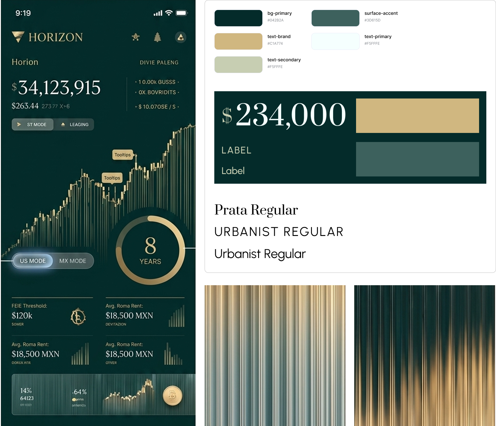
Early Midjourney-inspired style direction; color palette and typography evolved from here.
What I learned by actually doing it
The reality check on AI hype
The narrative around AI design tools suggests you can drop in a design and get a precise rendering quickly. Based on my research on the AI-native workflow, I figured I had enough preparation to jump into Cursor. This was somewhat true, but the reality was much messier than advertised. Early outputs were generic and hard to control through verbal prompting. Colors drifted slightly even with exact hex values specified. Font sizes crept down between sessions. Spacing migrated.
The tools are powerful but they need to be directed precisely. Vague input produces interpretation, and interpretation drifts.
The Figma HTML export workflow upgrade
Mid-session, frustrated with verbal iteration on a component that kept coming back wrong, I tried something different: I exported a Figma frame as HTML using a plugin and pasted it directly into Cursor as the spec. The output quality jumped immediately. Claude Code could read exact values of the font sizes, colors, spacing, component structure without having to interpret my descriptions.
This workflow of design in Figma, export as HTML, hand to Claude Code as the source of truth worked as my primary approach for every high fidelity screen. It wasn't something I found in a tutorial; it just made sense to me as a way to solve my problem. I count this as a very transferable learning from the project.
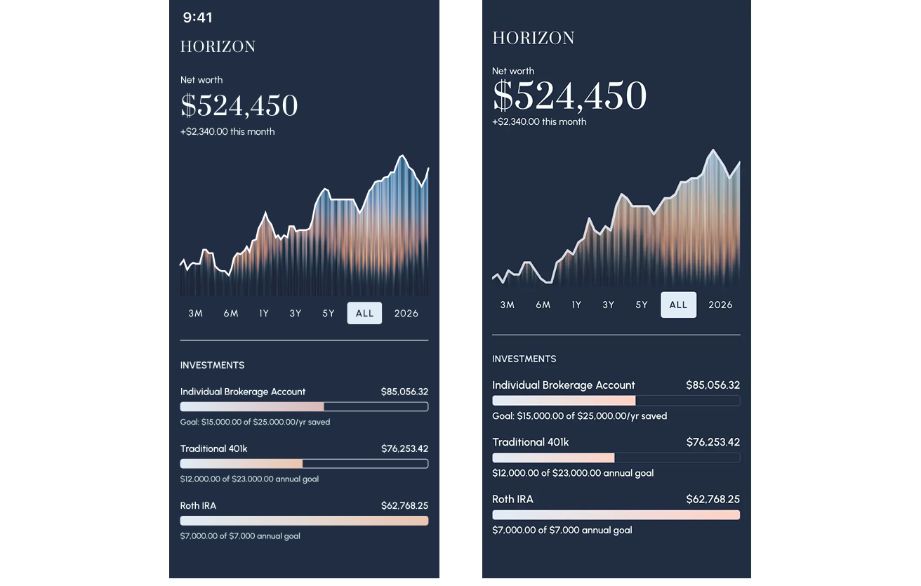
The Figma design (left) vs code output (right) using Figma HTML export into Cursor; a much cleaner match with less prompting
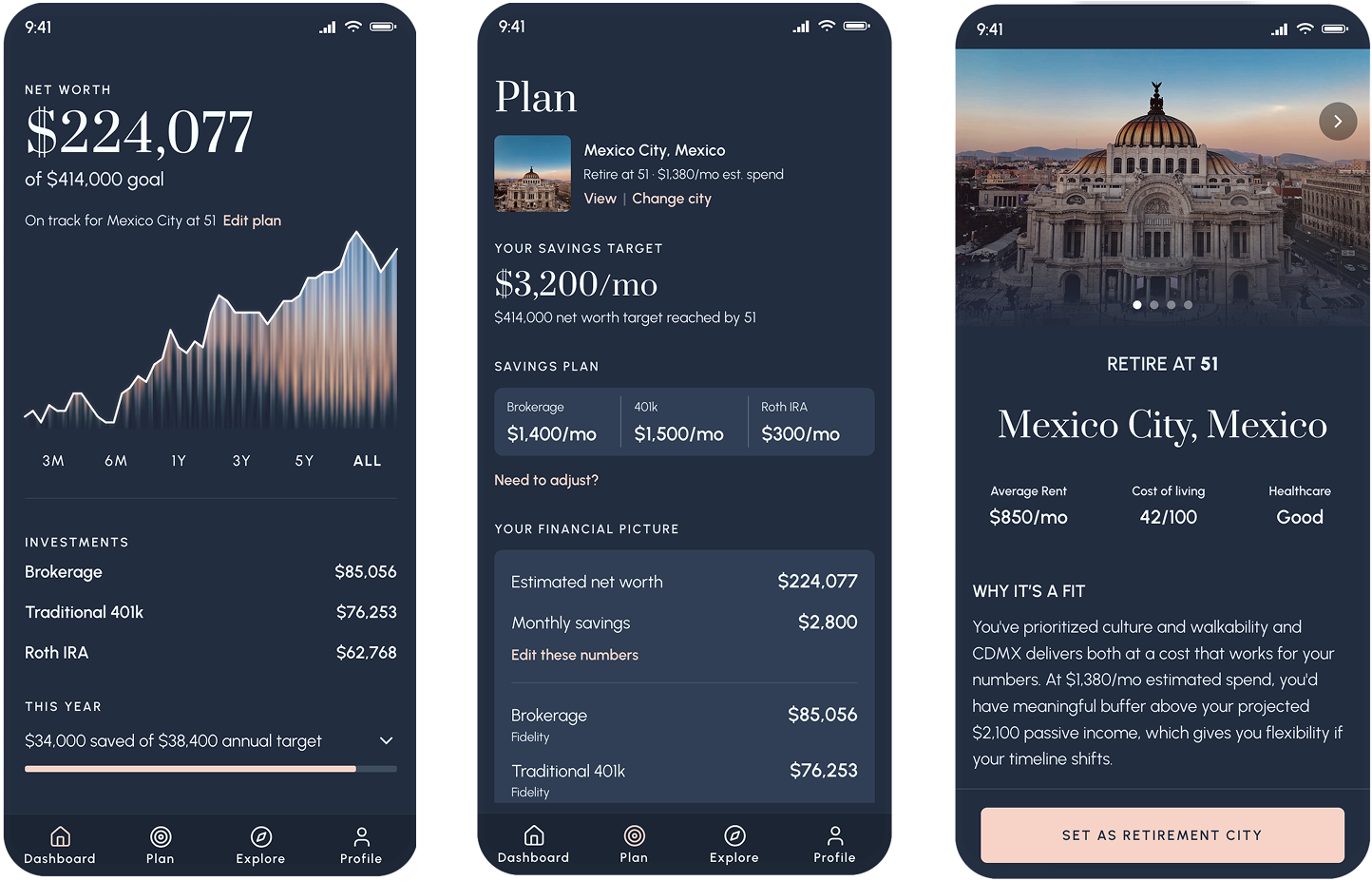
What Horizon became
Horizon is a four-tab mobile app: Dashboard, Plan, Explore, and Profile. The flow is linear on first use: onboarding leads to city exploration leads to plan setup leads to a populated dashboard. The nav only unlocks once you've completed setup. Every screen connects to the others.
The onboarding and "aha" moment
Five questions collect Claire's financial picture and lifestyle preferences. At the end, before asking her to create an account, Horizon shows her something real: her retirement age in Seattle, and three cities where she could retire earlier. Mexico City: age 51. Medellin: 52. Lisbon: 53. The numbers are calculated from her actual inputs. That moment, seeing a specific, personal number, is the hook into the account creation.
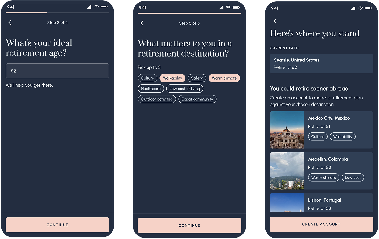
Retirement ages specific to Claire's financial profile, before she's even created an account
The city shortlist with AI refinement
After account creation, Claire sees a curated shortlist of five cities matched to her profile. It's not a search interface, but an AI-generated recommendation. Each card shows her projected retirement age, estimated monthly budget, and the buffer between her projected passive income and her estimated spend.
Above the shortlist is a text input inviting Claire to adjust her preferences further. Tapping it triggers a natural language refinement interaction. The prototype demos three sequential prompts that re-rank and re-populate the city list based on new criteria. The cities shift, new ones appear, and a loading state makes the AI feel present and working.
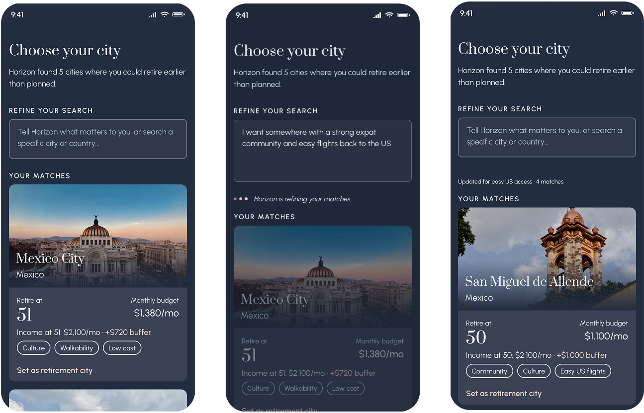
Natural language refinement, demoed in the prototype with three sequential prompts, each producing a different and contextually appropriate city list
The city detail
Each city gets a full detail screen: photo carousel, retirement age callout, cost breakdown, and a "Why it's a fit" paragraph generated by Claude that references Claire's specific preferences and financial buffer. Below that is a practical relocation guide covering visas, banking, healthcare, and taxes. The aim is to not be a travel brochure but to provide information that gets you ready to ask the right questions.
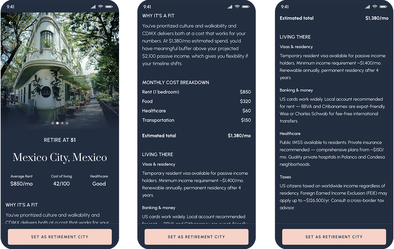
City detail includes editorial photos, personalized AI fit summary, and practical relocation information
The profile / AI memory screen
Rather than a traditional settings page, the Profile shows Claire what Horizon knows about her - in her own words, editable at any time. Her priorities, the things she's mentioned in natural language refinements, her financial snapshot, and the cities she's explored.
The design principle here: AI memory should feel like a living document the user owns, not a database record the system maintains. The difference between those two things is trust.
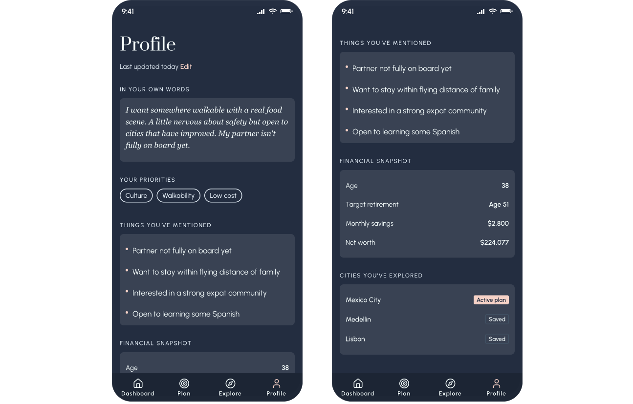
The profile screen - AI memory made transparent, personal, and editable
The dashboard
The dashboard is the "baked" view with everything configured, everything contextualized. Net worth, the fluted chart, investment accounts, and a single line that answers the real question: are you on track for your plan? "On track for Mexico City at 51. Edit plan." The dashboard doesn't ask you to think, it just tells you where you stand.
This is where the fluted sunset texture lives. Instead of trying to create the texture with CSS, I created a PNG and used that as the background of the chart. This is a simple but high impact approach, especially with the animation on page load. The line chart is drawn with a glowing tip, meant to be reminiscent of the sun and to further enhance the horizon metaphor.
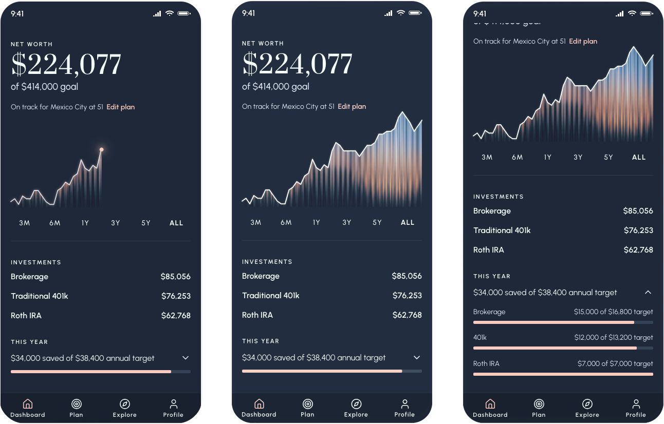
The dashboard: net worth, retirement target, and plan status in one view
What I learned
CLAUDE.md: The thing I wish I'd known from the start
A CLAUDE.md file is a persistent instruction set that lives in your project and gives Claude context about your design system, your rules, your component patterns across every session. Without it, I spent significant time re-establishing context: re-specifying colors that had drifted, correcting font sizes that crept down, re-explaining what a button should look like. With it, the AI has that context from the start and you spend your time on decisions, not corrections.
If I could go back and change one thing about this project, starting with CLAUDE.md would be it. This is the single most practical thing I'd tell another designer picking up these tools.
The right spec format changes everything
Verbal descriptions produce inconsistent output. Figma HTML export produces precise output. AI coding tools are not mind readers, despite their "magic" reputation. Structured, explicit input produces accurate output. Vague input produces interpretation, and interpretation drifts. The same principle applies to writing a good design brief. The medium is new; the principle isn't.
The next evolution of this workflow is a Figma MCP with a visual verification loop. It works by Claude Code opening the built prototype in a browser, comparing it visually to the Figma source, and self-correcting discrepancies. I discovered this existed after finishing Horizon, but it's where I'd start next time.
Design in the browser has a cost but it also has a payoff
Part of what I wanted to test was what it actually felt like to design in the browser and to make decisions in the real medium rather than approximating them in Figma first. So I did so intentionally and I learned the hard way: Information architecture changes in code, even with AI, are still expensive and cumbersome. Rearranging a flow, something that could take five minutes in Figma can take an hour in code, even with AI assistance. In a real world project, I'd spend more time doing lo-fi pressure tests of the information architecture before diving into Cursor.
But the payoff of designing in the browser was real too. Seeing the product working and actually tapping through it and feeling the interactions so early on surfaces decisions you genuinely cannot make in a static design tool. Some flow ideas I had earlier ultimately changed, and those were right calls that I could only see clearly once the product existed.
I don't think the lesson is "plan more, move slower." It's that the decisions most expensive to change like navigation structure, screen hierarchy, how the product's logic flows deserve explicit attention before you build. It might still change, but you can at least increase your odds of faster success. And this matters especially for AI-native products, where the IA isn't just organizing screens, it's encoding how the AI fits into the user's mental model. Getting that wrong is a logic problem, not just a UX problem.
Polish is the layer designers should own in code
Another thought I had coming from this project as I refined tiny pixels and defined animations directly in the code is that I think we should now stop spending five hours in Figma approximating a micro-interaction. Our developers don't have time to match it exactly. Do the polish pass yourself, directly in the working prototype, QA-ing the design as you go.
This isn't about taking work away from engineers at all because it's a layer of detail work that design should own anyway. Designers owning visual QA directly in code is additive to the whole team's productivity. Engineers get to do the interesting architectural work. Designers get craft fidelity. The Figma file stops being the source of truth for details that only exist at the pixel level. Everyone wins.
What's next
A genuinely agentic Horizon
The natural language refinement interaction points toward something more ambitious for a future version of Horizon: a genuinely agentic experience. Rather than Claire expressing a preference and the system re-ranking a static list, an agentic Horizon would take autonomous action on her behalf - fetching live rental data for cities that match her criteria, cross-referencing flight routes to her home city, pulling current visa processing times, and synthesizing all of it into a recommendation before she thinks to ask. AI would be working for her in the background, surfacing the right information at the right moment in her planning journey, instead of responding to her input. The design challenge of making that feel transparent, trustworthy, and not overwhelming is exactly the kind of problem that makes AI-native product design interesting right now.
Is any project ever "done"?
Horizon feels like it's not done to me because it isn't. There's more to design, more to build, things that would be better with another pass. That's the nature of product work, and it's worth saying plainly: one person cannot do all of this at quality without burning out or cutting corners. The AI-native world makes it tempting to forget this because things move so fast. Velocity isn't quality, and we already know that. We just have to remember we know it.
In real life I wouldn't be the only person owning this. There would be user research to validate the product direction, a product manager thinking through the business model, an engineer catching the architectural decisions I glossed over. A spec project doesn't need all of that but knowing what you're skipping, and why, is part of doing it right.
"Velocity isn't quality, and we already know that. We just have to remember we know it."
View Horizon Prototype