
Members lost in a complex insurance landscape
GLP-1 programs involve multiple touchpoints: eligibility determination, coverage verification, prescription fulfillment, and ongoing engagement requirements. To keep their prescriptions covered, members must meet employer-mandated criteria, including weigh-ins, coaching sessions, and food tracking, all within specific timeframes.
Before this project, members' only visibility into these requirements was a dense PDF buried in their Health Summary Report. This lack of transparency was the #1 source of member confusion reported to customer support.
The Complexity
- Multiple stakeholders: Product, Clinical, Operations, Marketing, and Member Support all owned pieces of the experience
- Insurance variability: Coverage rules and engagement criteria varied by employer and pharmacy benefit manager
- High stakes: GLP-1s cost ~$1,300/month, members risk losing coverage if they don't meet criteria
- No unified view: No team could see the complete member journey across all touchpoints
Aligning six teams around shared understanding
This project required deep collaboration across Product Management, Content Strategy, Marketing, Clinical, Behavioral Science, and Member Support. No single team owned the full member experience, so I took on the role of creating shared artifacts that could align everyone around the same understanding of the journey.
Beyond designing UI, I advocated upstream for simplifying the engagement criteria themselves. Working with Clinical and Behavioral Science, I pushed for criteria that were easier for members to understand and complete, without compromising the program's clinical effectiveness or cost-containment goals. I also partnered closely with Marketing to ensure cohesive messaging from initial communications through the in-app experience.
Mapping the end-to-end journey
I became the team's service blueprint expert, interviewing cross-functional stakeholders across Product, Clinical, Operations, and Marketing to build detailed maps of the member journey. This work revealed deep UX problems that extended well beyond any single team's purview.
Service blueprint: Getting into the GLP-1 program
Service blueprint: Meeting ongoing engagement criteria
The blueprints visualized how members move through enrollment, eligibility determination, prescription coverage, and ongoing engagement, while also mapping the backstage systems and handoffs that often broke down.
Validating pain points across the journey
I partnered with UX Research to run a cross-functional pain points workshop and usability testing that validated our hypotheses about member confusion.
Pain points workshop
I convened stakeholders from Product, Clinical, Operations, Marketing, and Member Support to document and prioritize pain points across the journey. Together, we identified the most critical issues affecting members and mapped them to specific journey stages.

Pain points mapped across the full journey from client onboarding to member reporting
Top Pain Points Identified
- Members don't understand program criteria: The #1 issue, members unclear on what they need to do to maintain coverage
- GLP-1 coverage and cost not transparent: Members don't know what's covered until they try to fill a prescription
- Poor discoverability: App doesn't surface GLP-1 offering to eligible members
- Internal teams lack visibility: Support can't identify issues or direct members to help
- Disjointed communications: Branding and messaging inconsistent across channels
Usability testing
We tested our proposed solutions with 10 participants to validate that the new designs actually improved comprehension. The research compared two prototype versions and evaluated marketing emails alongside the in-app experience.
End-to-end user flow tested with participants
Usability Findings
- Criteria timeline clarity: Version B resulted in clearer understanding of requirements and timeline, including how they affect refills. All participants understood the shifting 30-day window concept.
- Progress tracking: Participants wanted to see a graphic representation of their progress. They found the Action Summary table helpful and expected dates to reflect the coverage window.
- Next steps expectations: Most participants expected to click "What Happens Next" after completing criteria. At least 2 asked for a summary they could take to the pharmacy confirming they've met all criteria.
- Tone considerations: Many participants had a punitive or self-critical tone about requirements ("feels like a threat", "are they judging how much I've lost?"), suggesting opportunity for more supportive framing.
- Marketing email preference: V1's detailed content was preferred for clarity, but participants wanted V2's friendlier, more inclusive tone.
Creating transparency for members
Based on the service design findings and research, I designed an engagement criteria ecosystem, a suite of features that work together to help members understand and track their coverage requirements.
Guidance & Wayfinding
Members will now have guidance starting the beginning of the app experience if they indicate interest in GLP-1s and are eligible for our weight management program. This guidance continues with a "Start your journey" task, helping members determine which doctors are covered by their employer, and gives them a preview of their engagement criteria, should their employer require it.
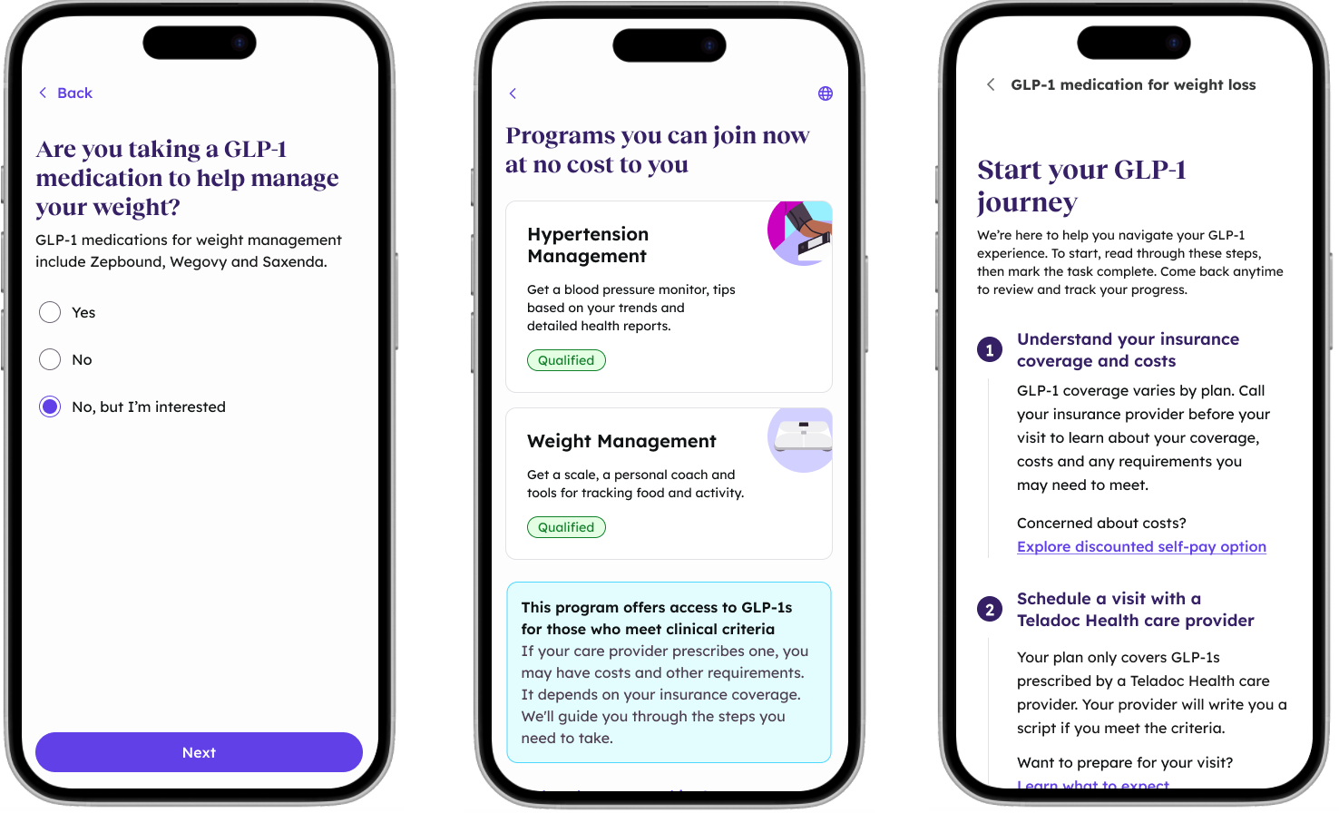
Navigation and transparency improvements across the enrollment and onboarding journey
Engagement criteria tracker
The centerpiece solution: an in-app tracker that shows members exactly what they need to do to maintain their prescription coverage. Members can see their progress on weigh-ins, coaching sessions, and food tracking, with clear deadlines and status indicators.
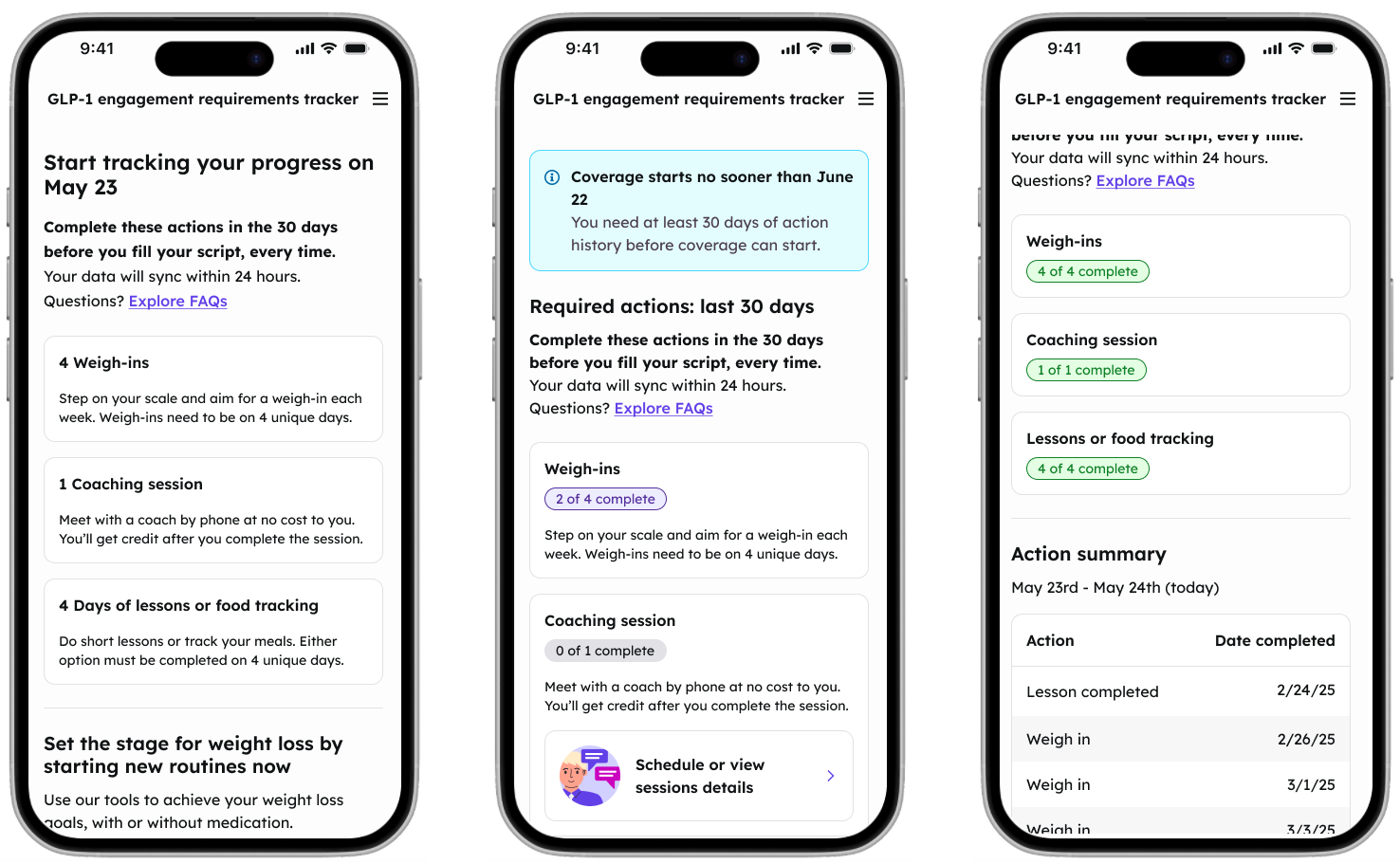
Engagement criteria tracker with progress visibility and action summary, shown at multiple points in time
Positive reception and strategic impact
The simplified criteria and new tracking experience received strong positive feedback from clients and internal stakeholders.
"This is so much easier to digest. I'm so glad the rewording is happening. It'll make a lot more sense to our members."
—Client benefits lead
Results
- Shaped strategic roadmap: Research directly informed strategic priorities, with engagement criteria ecosystem and navigation enhancements as top initiatives
- Became the service blueprint expert: Created reusable methodology now adopted by other teams facing similar cross-app complexity
- Earned stakeholder trust: Product Manager noted he's "proud to show the designs to clients"
- Supporting major deals: Work contributes to a high-priority program with major client deals
What I learned
This project reinforced that the most impactful design work often happens outside the screen. By zooming out to the service level, I could identify problems that no amount of UI polish would solve and advocate for systemic changes that improved the experience at its root.
I also learned the power of creating shared artifacts. The service blueprints became a common language that aligned six different teams around the same understanding of the member journey, making it possible to coordinate solutions across organizational boundaries.